Problem Statement
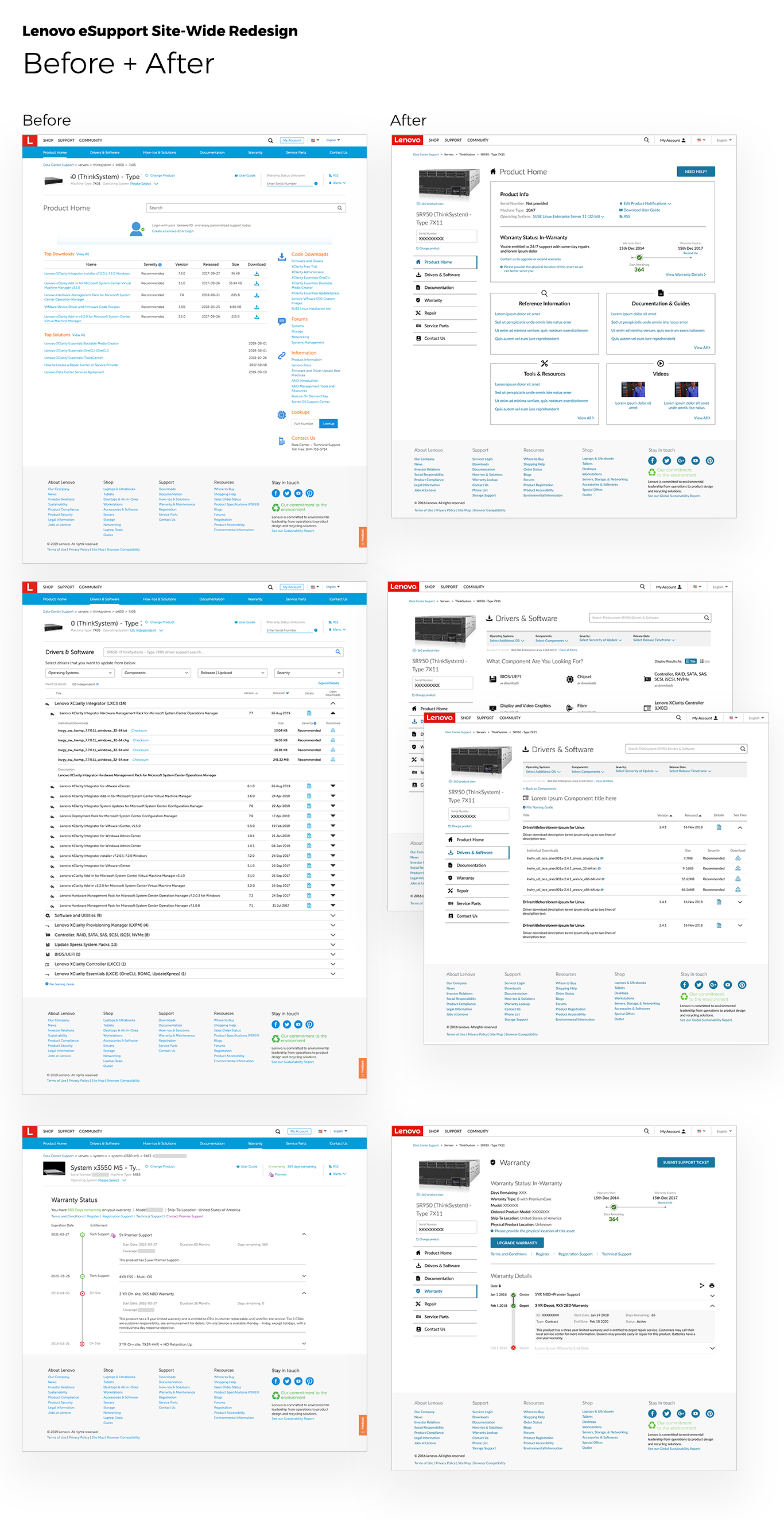
How do we improve the existing Lenovo eSupport Product Support Page (PSP) experience for our Data Center Group users so that they may easily and efficiently locate device-specific downloads, support articles and user guides at a general level or with serial number specificity.
Please note: This was the original problem statement that was then expanded and applied to the rest of the verticals of eSupport as the scope grew to include PC, Smart Device, and Mobile.
Roles
Creative Direction
UX/UI Design
Additional Contributors
UI/UX Designers: Yuan Yin
UX Researcher: Dr. Jojo Sprufera
Tools
Sketch App
Invision
Adobe Illustrator
background
The eSupport business unit decided that the site needed to be redesigned based on negative customer feedback through direct support contact (customer calls) and Online polls (“how easy is it to find what you are looking for?”) and internal pressure for a unified interface that connected all the tools that were being added to the site.
Research
Before beginning any design, our researcher, Dr. Jojo Sprufera, conducted user interviews, usability and task completion testing, and sat in on user panel discussions regarding the existing site, user's unique needs, and what users found confusing or misleading. Throughout the design project, we tested many solutions for the biggest pain-points as well as overall design updates through both moderated and unmoderated user testing. Using the many user flow maps we created, validation testing is constantly being conducted to make sure that we are only improving user experiences.
Language, Categorization and Navigation
We learned that many issues raised by our users could fit into 3 main areas:
Language, Categorization and Navigation
Language
We found that in previous site versions, the language that was being used to not only identify items but also to filter search queries, navigate through the site and populate forms was not always catered toward a user and rather utilized internal jargon.
Categorization
For some of the content, it had been categorized and organized in a way that was (again) catered toward internal organization and structure, instead of in the way an end-user would associate items. This left users unsure that the information they were getting was actually a solution to their problem.
Navigation
While the previous version of the site had a page navigation system at the top, users still found it difficult to know where they actually were in the site environment. For example, there was no UI change for example to signal to the user that they were outside of the PSP environment and now in the overall eSupport environment and there was a lack of simple breadcrumbs to aid in orientation.
Outcomes and Impact
While we are constantly reviewing feedback and revising design, we have done our best, at the outset, to address the pain-points and shortcomings of the previous site design and structure. By giving slightly more emphasis to the PSP navigation in a way that visually identifies that part of the site as a more device-catered experience, adjusting language and categorization wherever possible and increasing visual contrast for the design elements on the page, we have been able to improve usability and customer satisfaction.
As previously mentioned, over the course of this project, its scope grew drastically from one specific user group to Lenovo’s entire product portfolio. It was at this point that we brought in another designer, Yuan Yin, to help execute the redesign across these new portfolios and provide insight for their particular needs for both business and user groups. We worked together to adjust the site templates as needed to address their unique needs and coordinate across multiple development teams and product owners.
The Lenovo eSupport site-wide redesign was a project completed with the Data Center Group and PC Group at Lenovo.
