This digital periodical, designed for iPad, that was based on the topic of two texts that I had used for both a and traditional book. The content for this periodical are political articles that are written by non-politicians. The title reflects this because politics can be misleading just like my title. Since the title doesn’t reflect politics, I want it to attract an audience that wouldn’t normally be interested in reading about politics. The symbolism of the imagery is inspired by the point of view that in politics, nothing is ever as it seems and that in order to make the bill pass, they distract the public with a pretty face or a different issue. The colour scheme would be pulled from the colour of the masthead, which would change with every issue. Also, for the cover, there would always be this hybrid of images (pulling from hybrid of a spork). One of the images would be a method of distraction, in this case a seductive picture of a woman, and the other image would be one of political nature. I chose this particular image because of the content of the Frank Zappa essay, in which he speaks in depth against the censorship of vulgarity and sensuality within music lyrics and music videos. All imagery is found but the layout and concept is original.
SPORK - Digital Periodical
You may also like

CEI: The Digital Office Website Redesign
2015

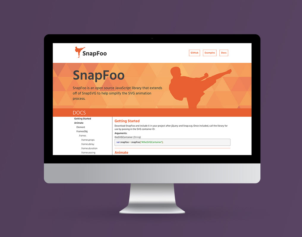
SnapFoo JavaScript Library Website
2015

Lenovo eSupport Product Support Page Redesign
2019

IBM Commerce - Contract Lifecycle Interactive Microsite
2015

Statrack Client Management Portal
2019

Six Forks Smiles Website Redesign
2017

IBM LinuxONE™ Wired Takeover Campaign
2016